Culture Stack
Design evolution · 2025—26 · Founder, design, buildTwelve versions of one question: how do you draw a culture without pretending it is a score?
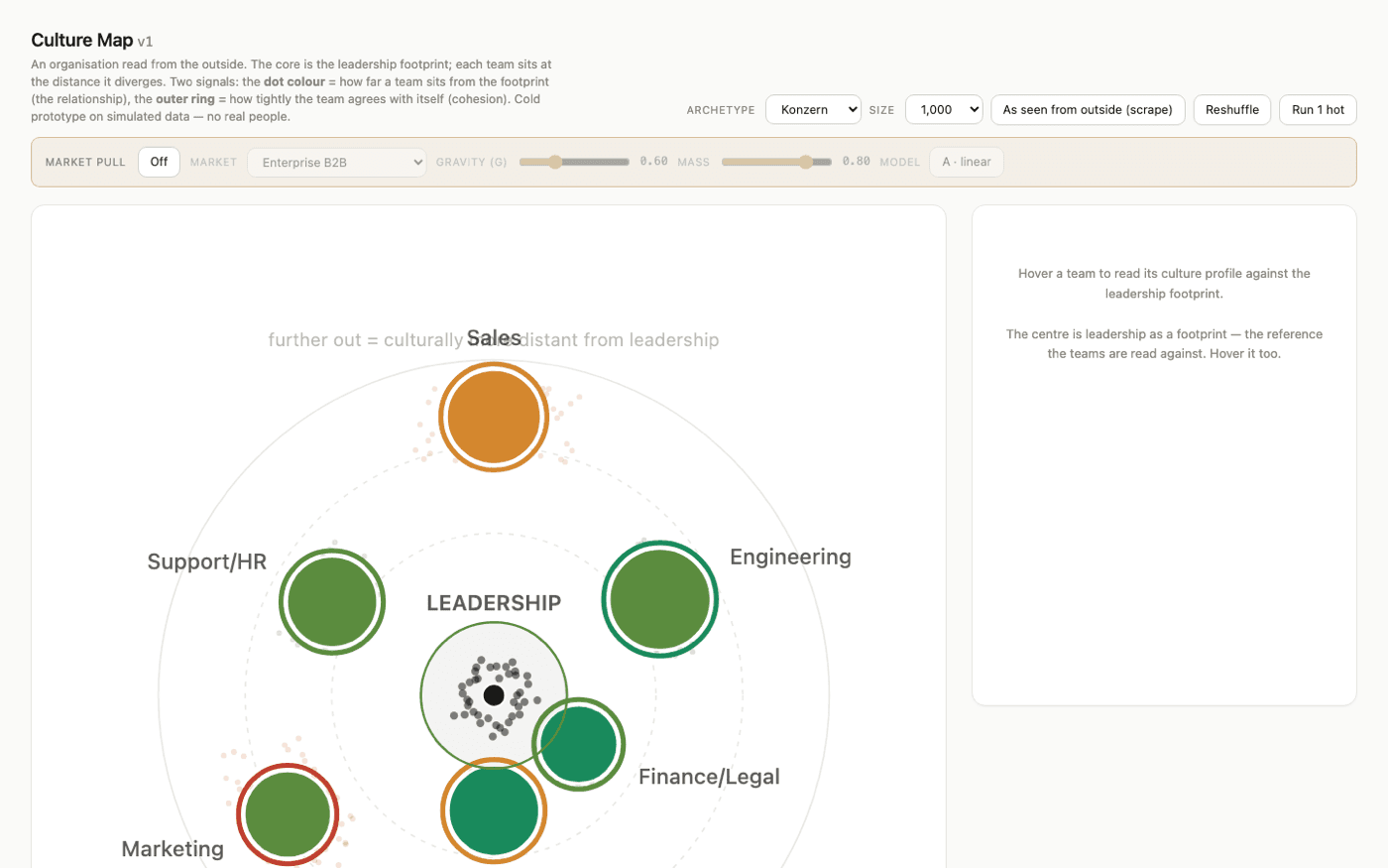
The first map was legible and useless. Bubbles around a leadership core, colour for distance, a ring for cohesion — pretty, and nobody could say what to do on Monday. It also implied precision the data did not have.
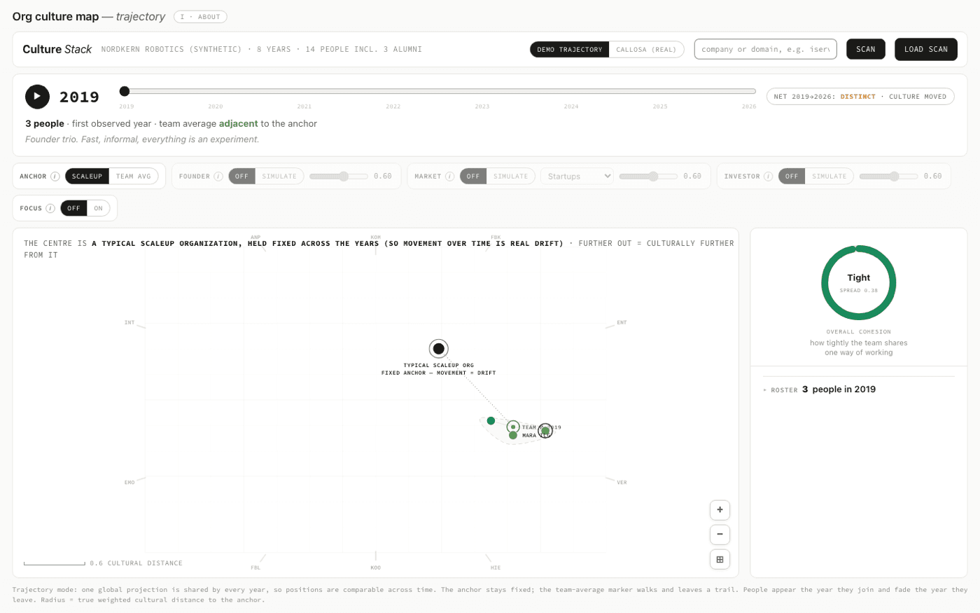
Stop drawing a snapshot; draw movement. Fix the anchor, play the years, let the team average walk and leave a trail. Culture stopped being a diagnosis and became a history you could argue with.
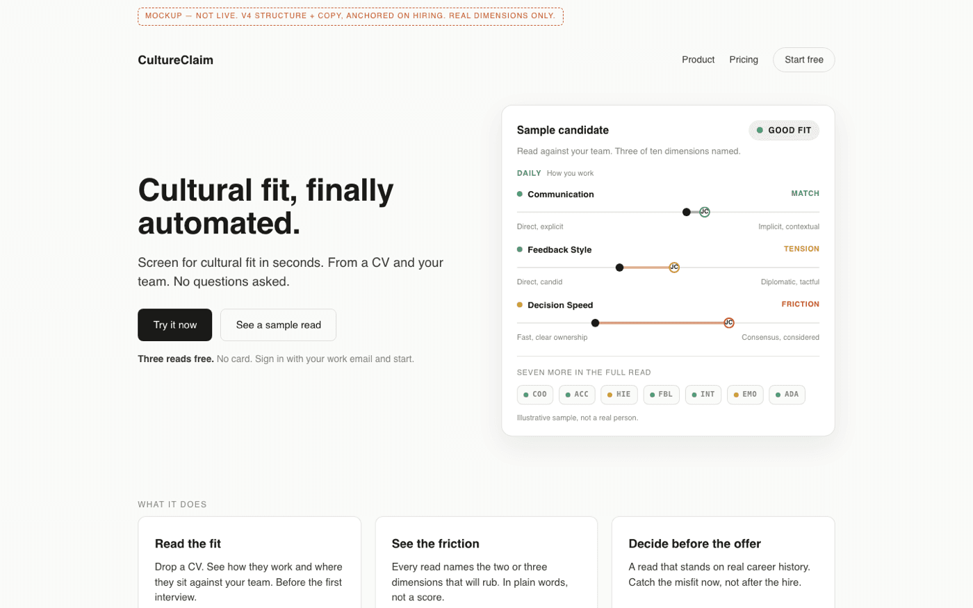
The landing page had to survive a stranger with eight seconds. No score, no chart-as-hero: one sample read, three named dimensions, and the friction stated in words. The product is the sentence, not the graph.
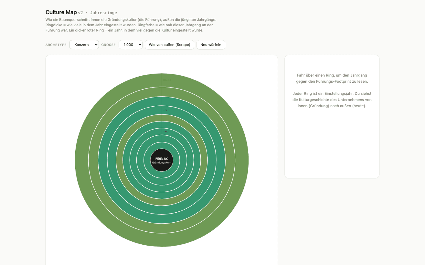
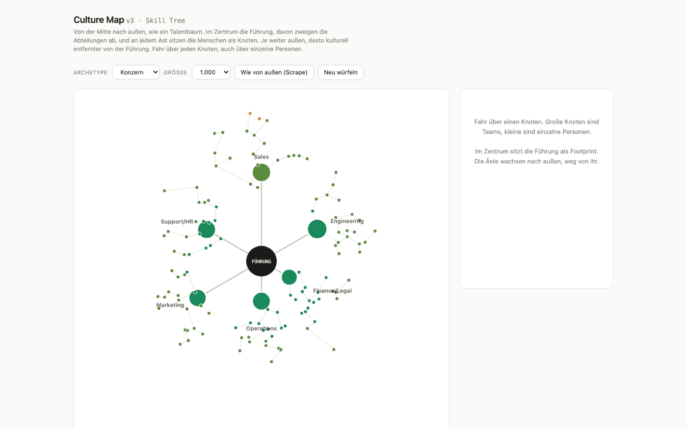
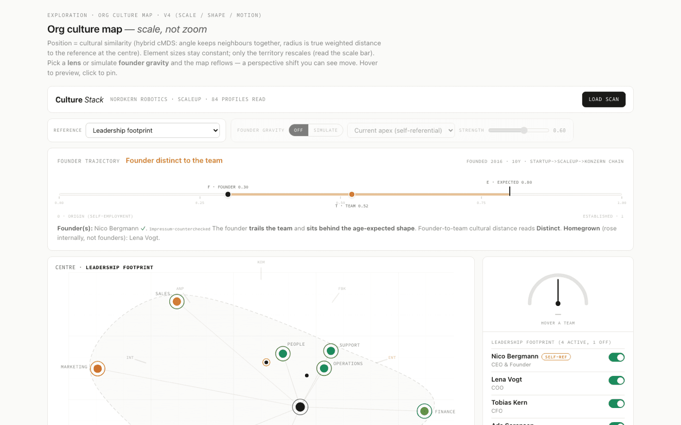
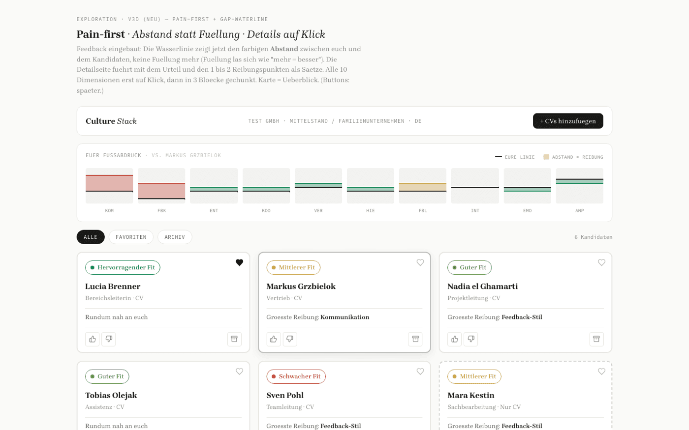
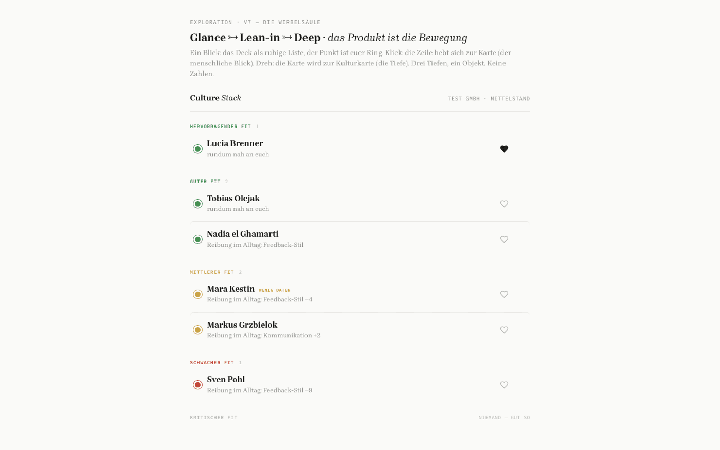
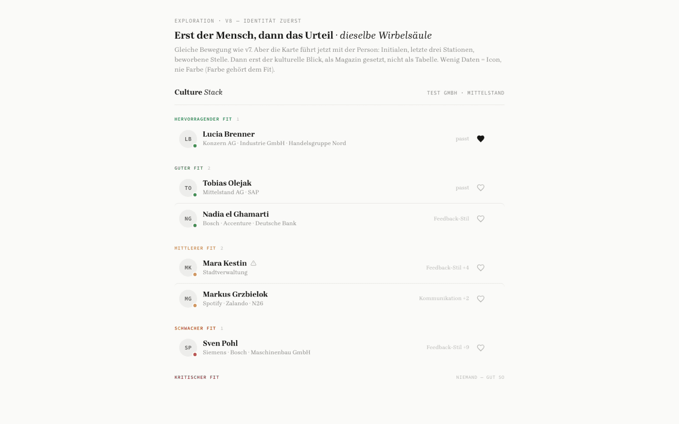
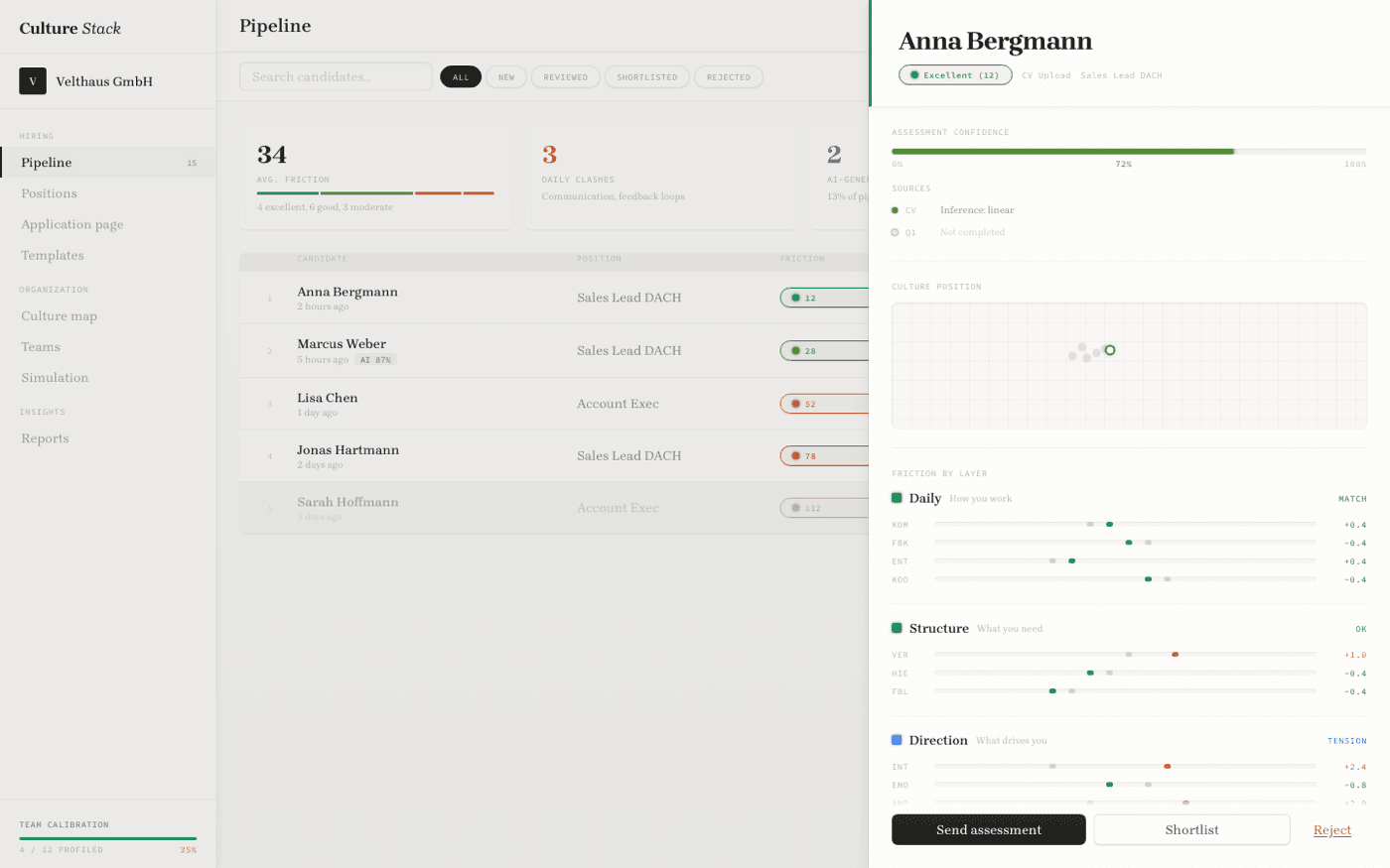
Side by side, v1 read as astrology and v5 read as evidence. The change was not visual polish: it was removing the number and making the reader do the interpretation. Pilot users stopped asking what the score meant and started arguing about the trail, which was the point.